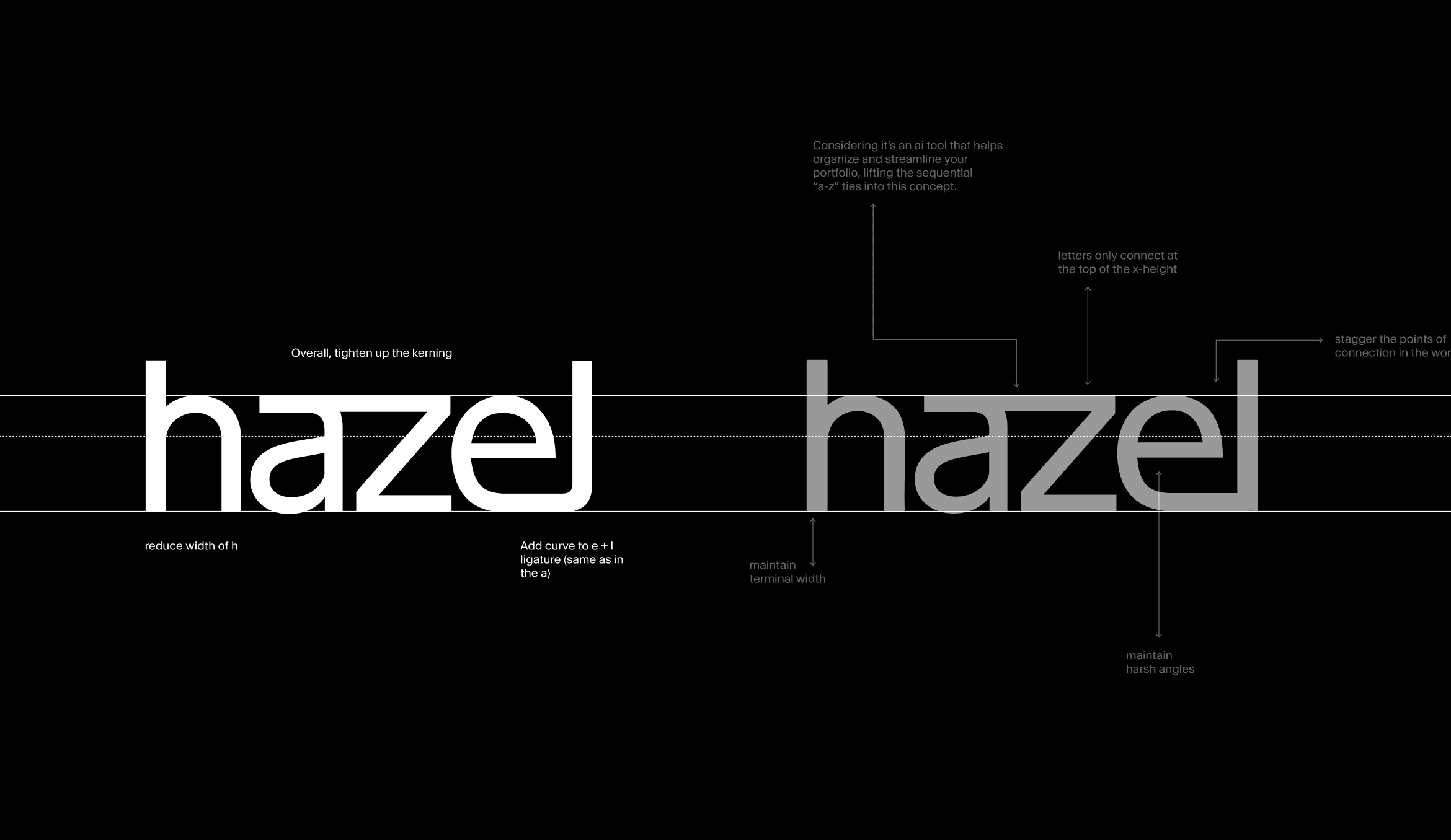
Hazel AI
2025

The brief
Altruist was launching Hazel, a new AI assistant built specifically for financial advisors, and needed a visual identity to match. The challenge was building something that felt rooted in Altruist's evolving brand system while still standing on its own, as a product that could exist independently, speak to a broader audience, and hold up across both marketing and product surfaces.
My role
I designed the brand elements and corresponding marketing moments for this project, working closely with a product designer, product creative, copywriter, illustrator, and creative director. I collaborated with product and marketing leads and legal/compliance to make sure everything aligned with the company mission, the Hazel roadmap, and regulatory requirements.
The team
Daniel Haire, Robert Manukyan, Gokul Ramanathan, Fernando San Martin, Abigail Spooner, Jacob Grubbe, Steve Kane, Bee Gray, Cole Cradduck


Setting context
Altruist is a digital custodian platform built exclusively for financial advisors. Around the time of this project, Altruist had just completed a major rebrand with Collins, a new identity designed to strip away complexity and communicate with clarity and conviction. Hazel needed to feel like a natural extension of that system while carving out its own space.
Hazel is Altruist's AI assistant: more than a notetaker, it handles scheduling, email drafting, meeting prep, document parsing, and contextual Q&A, all with an advisor's specific context built in.


Creative concept
We landed on "Sky's the Limit" as the overarching creative direction. The idea: there's so much advisors can accomplish with Hazel, and we wanted the visual language to reflect that sense of possibility: expansive, open, limitless. This translated into two visual registers working together: vast, immersive skyscapes as the brand's emotional backdrop, and detailed UI moments that show exactly how the product works in practice.


Waitlist landing page
The first version of the Hazel site lacked clarity around what the product actually does and why it's right for advisors. Our goal was to fix that: deliver a more polished waitlist experience with a stronger value proposition, dynamic product animations, and a visual system that felt alive.
We anchored the page with a rotating headline ("Hazel is your meeting assistant / calendar assistant / inbox assistant / research assistant / client relationship assistant") so visitors immediately understood the breadth of what Hazel can do. The sky imagery ran throughout, keeping the brand feeling cohesive while the product UI moments lower on the page grounded everything in reality.
Product animations
We developed four Lottie animations for the landing page, each capturing a core advisor use case: task and meeting prioritization, meeting notes captured and summarized, emails auto-drafted from context, and Hazel answering anything using advisor-specific data. These ran as part of the scrolling product showcase on the waitlist site.
Impact
The identity shipped under a compressed 4-week timeline. Despite the time pressure and the inherent tension between expressive brand identity and a minimalist product UI, the system landed with strong alignment across product, brand, and GTM teams.