Robinhood Gold Campaign
2023
The goal
The Robinhood Gold team launched a multichannel test campaign in November of 2023. The main goals of this campaign were to amplify Gold’s cash sweep offering to the world, spread product awareness and drive sign-ups. Crucially, the campaign needed to do this in such a way that it would stand out to customers across a diverse channel mix (connected tv, podcast ads, paid social, affiliate placements, and more) AND feel natural alongside Robinhood’s core brand materials.
The campaign was a huge undertaking, to say the least. We collaborated with our partner agency AKQA to respond to the brief and execute across all channels. Our in-house creative team owned the design and production of all Robinhood-owned channel assets.
The team
Tim Scales, Devon Lach, Abigail Spooner, Phil Eichenauer, Alma Kim, Shawn Anderson, Harrison Pollock, Caleb MacIlvaine, Carley Olivas, Laurent Linville, Anna Lee, Dan Wright, Nicole Yesbeck, Andy Montgomery
The process
We began by establishing the grounding creative concept: “Make your money do the MOST with Robinhood Gold.” (A few key data points to keep in mind Gold customers earn a high APY on their uninvested cash (4.9% APY at the time of the initial launch), with no cap on earnings, and are protected with FDIC insurance up to $2.25M at partner banks.)
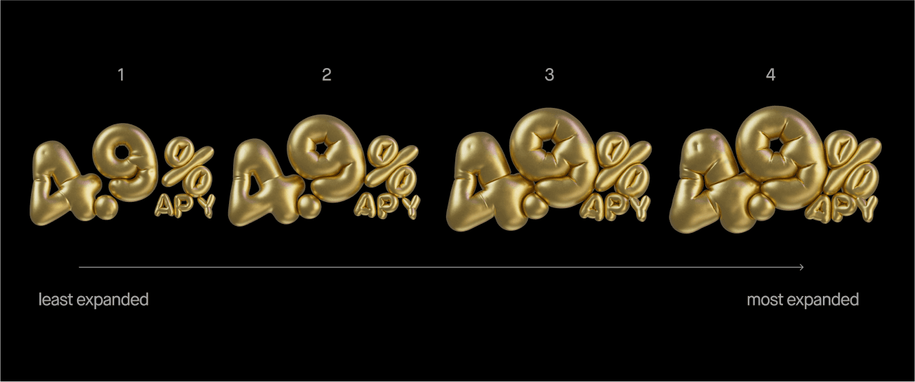
Through all of the campaign work, we ultimately wanted to make sure that we were exploring and reinforcing the key idea of expansion and scale. As we dove into the process, we kept asking ourselves: how do we make the hero number (4.9% APY) feel HUGE?
In the hero TV spot, the key messaging was accompanied by an energetic mix of expanding balloon visuals and live-action, utilizing extreme fisheye imagery and larger-than-life camera angles. For our owned channels, where we rarely if ever use photography and live-action in brand creative, we faced a tricky design problem: how do we get this concept to work alongside our master Robinhood brand, while still feeling clearly connected to and in service of the larger campaign?
:30s CTV spot (4.9% APY version)
At the start of the project, we explored a few ways in. We jumped into more typographic and editorial-style poster sketches to start, playing with the concept of visual maximalism to bolster that key idea of the MOST! While we came up with some fun sketches for this idea, we found that a lot of the treatments felt too busy and overwhelming.
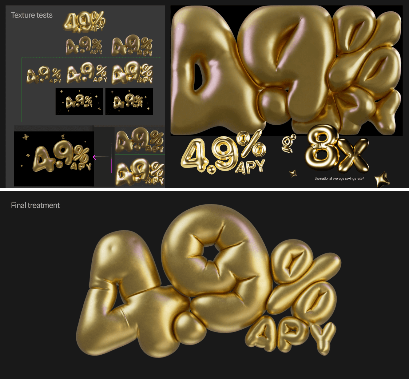
We were starting to like where some of the compositions were heading, but we were really struggling with the 3D design of the numbers themselves. We wanted the numbers to feel almost over-inflated, but they still needed to read well even at their most expanded state. We went through countless iterations on the design, structure, and inflation level of the numbers and other elements. On top of that, we also tried out a wide range of textures and finishes on the visuals. We found that a super-shiny metallic finish on the elements looked very luxe, but the high contrast in the highlights and shadows made legibility difficult. We landed on a softer mid-tone gold texture with subtle purples and pinks in the highlights. The overall look of the final elements feels larger than life, but at the same time very readable!
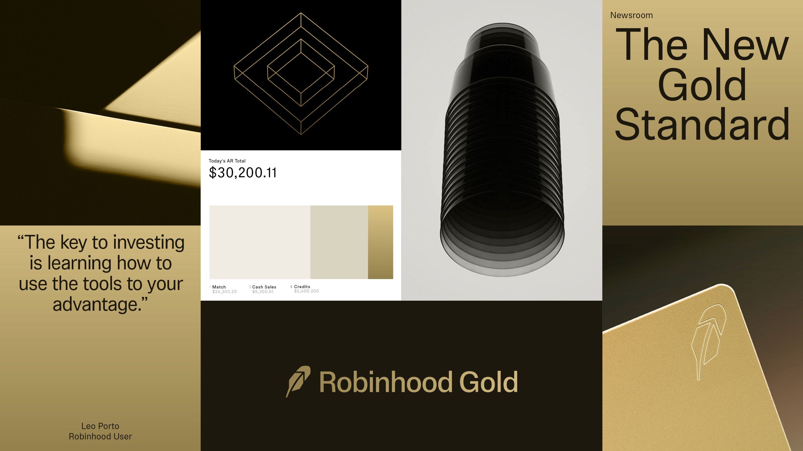
Moodboard + Initial Explorations
In the animation stage we found ourselves iterating even further. In the robinhood.com homepage takeover, we wanted the elements to quickly inflate and then “settle” with a very subtle floating motion. It was a lot of trial and error with the dynamics system to get the physics right and design we wanted (wrinkles, floatiness etc). With this type of 3D work, we were relying on Cinema 4D’s physics engine to get us where we needed to go, and a lot of time was spent dialing different parameters up or down over and over until it just started to look right.
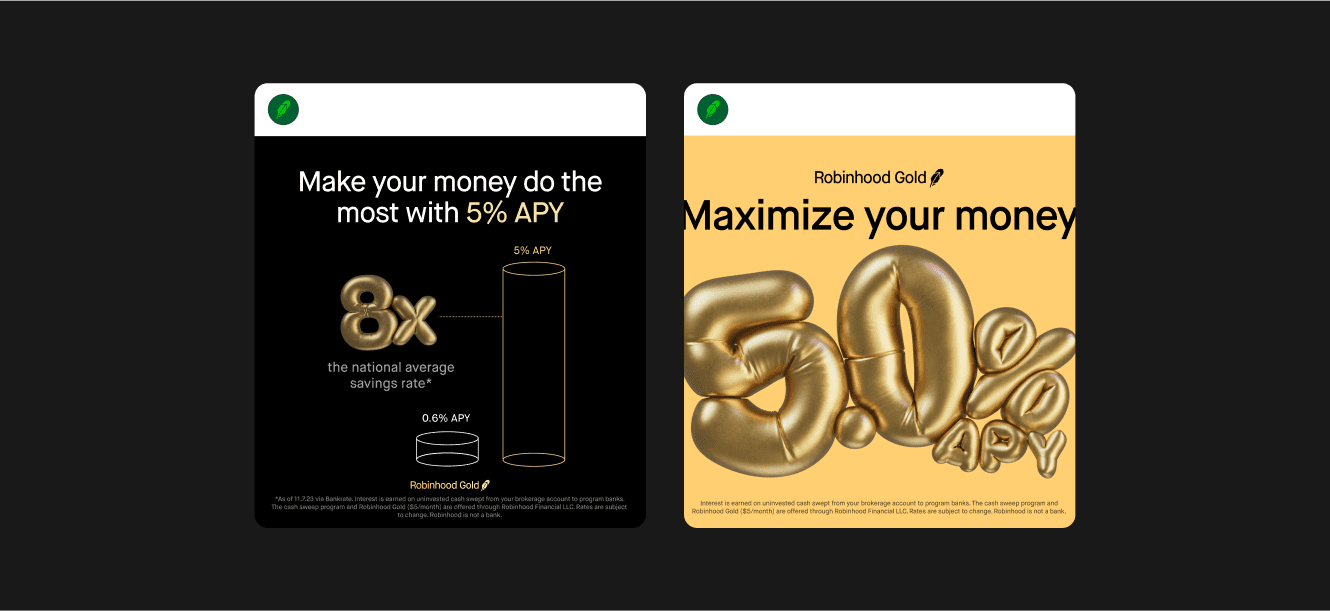
After finalizing the suite of 4.9% assets, we got some exciting news—and raised our rate (again) to 5% 🤯This meant we needed to redesign and update all of our assets to work with the new 5% APY rate, and work collaboratively to make the adjustments across all of the surfaces.
The results
The whole team worked incredibly hard to get this campaign out the door on a tight timeline, without compromising on the many tiny details that went into every piece of creative. The ad campaign launched without a hitch, with the CTV ad broadcasting across 40 U.S. cities over the course of about a month.
Looking back on this project, I’m really proud of the finished result, and I’m even more proud of the flexibility the team had when responding to unexpected deliverable changes. There are some process pieces we’ll likely want to do differently next time. For example, when working with rendered 3D elements in the future, we should plan to resolve the 3D visual direction, texture and color etc. across all partners and stakeholders earlier in the process. We found ourselves trying to marry the 3D inflation textures used across the tv spot (which was produced by our agency partner) and the internal assets pretty late in the process because our working teams were working independently of one another. I think we’ll make a point to develop the direction for assets like these more collaboratively in future projects, to ensure less back and forth.


